Adulting
With one partner, I interviewed 13 young adults and designed a mobile assistant that pulls their tasks, habits and daily briefings into one place. I led the prototype in Figma.
Problem
Young adults living alone for the first time juggle bills, errands and deadlines with no real system — and feel overwhelmed.
My role
UX Researcher & Prototype Designer
Solution
A mobile assistant that pulls tasks, habits and daily briefings into one calm place, with a once-daily task check-in.
Outcome
A clickable prototype covering 6 core flows, grounded in 13 user interviews.
What I did
- Interviewed 13 young adults with my partner, 20+ questions each
- Synthesized the findings with a card sort, affinity map and journey maps
- Turned 3 key insights into 6 core user flows
- Designed the high-fidelity screens and clickable prototype in Figma
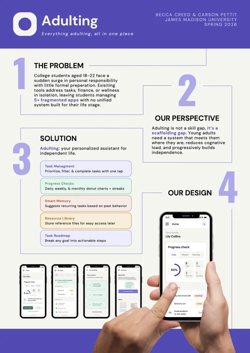
- Presented the final prototype on the project poster
 Overview.pngTXTProblem.txt
 Research.pdfPDFInsights.pdfFIGIdeation.fig
 Design.fig
 Outcome.pngDOCResearch Doc.gdoc ↗
Young adults living on their own for the first time juggle bills, errands, school and work — often with no real system for keeping track of it all.
Who it’s for: 18–22 year-olds moving into their first apartment or dorm.
How might we help young adults stay on top of new responsibilities without adding more stress?
My partner and I interviewed 13 young adults about how they manage life on their own.
My partI co-wrote the interview questions, ran interviews and co-led the synthesis.
We synthesized the interviews with a card sort, affinity map and journey maps. Read the full research ↗
Fragmented systems
Users switch between multiple apps or rely on “keeping things in their head,” so responsibilities get forgotten or delayed.
How might we bring reminders, schedules and tasks into one place?
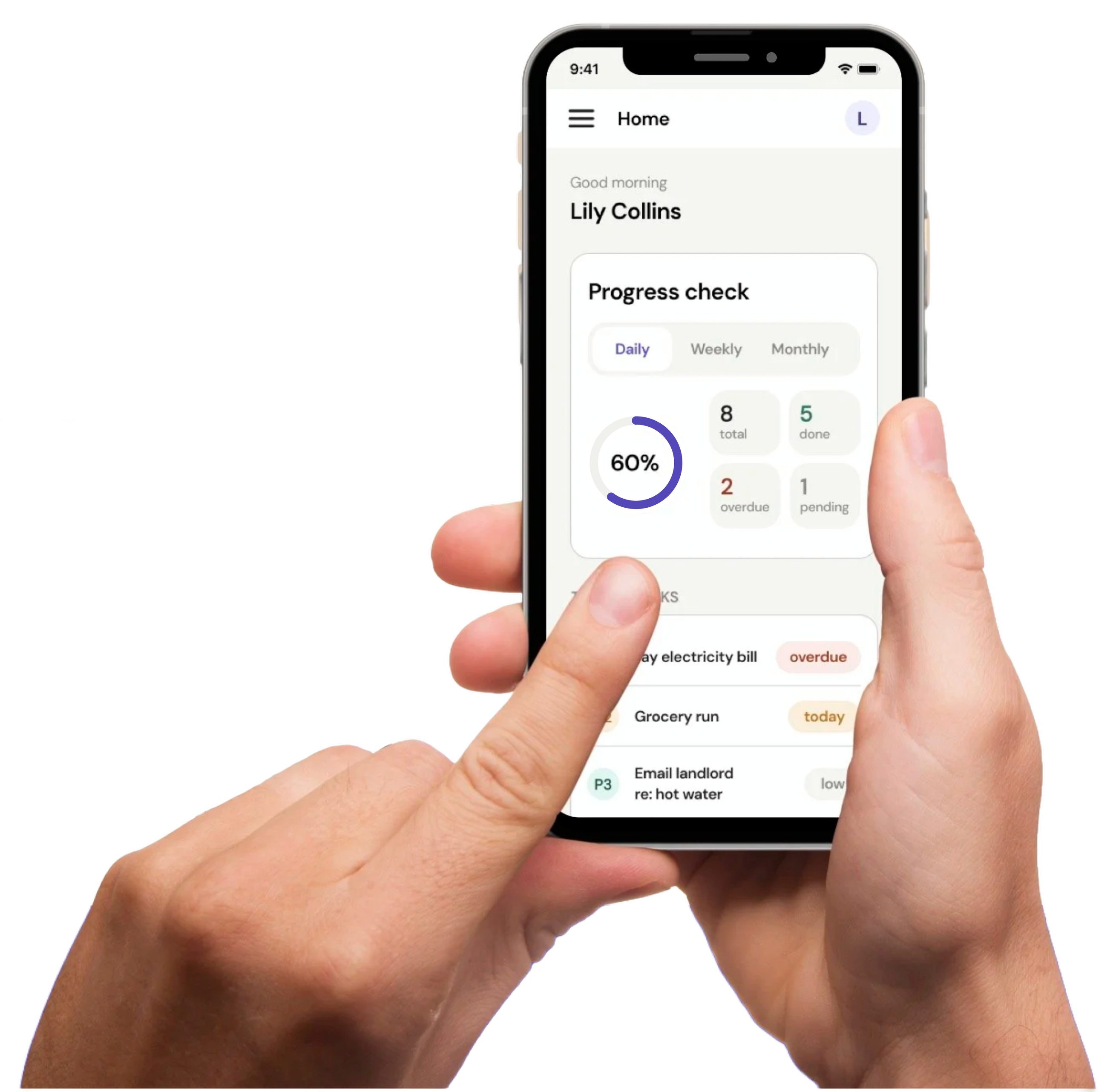
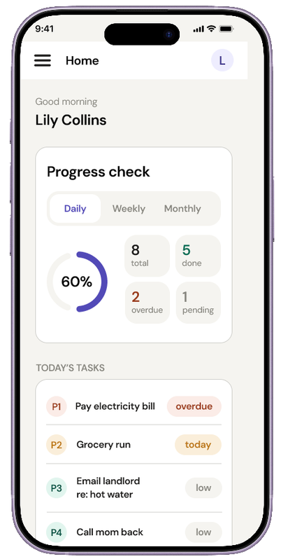
What I designedOne home screen where tasks, reminders and the day’s schedule live together.
Cognitive overload
The strongest theme was feeling overwhelmed — not just remembering tasks, but prioritizing competing responsibilities.
How might we simplify information instead of adding notification pressure?
What I designedA single daily briefing instead of a stream of notifications.
Operating reactively
Users act only once stress or urgency builds; current tools don’t support planning ahead.
How might we support proactive planning through deadline forecasting, priority ranking and a once-daily task pop-up?
What I designedA task road map that ranks what’s due and forecasts deadlines before they become urgent.
I turned the three insights into six core user flows.
- 1Create & verify account
- 2Input user preferences
- 3Task road map
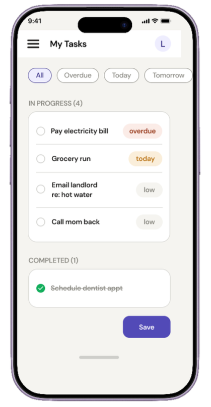
- 4Mark task as completed
- 5Upload files
- 6Review dashboard & history
I designed the high-fidelity screens and linked them into a clickable prototype in Figma.
My partI designed the visual style, laid out every screen and wired the prototype for all six flows.
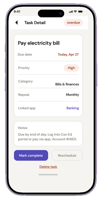
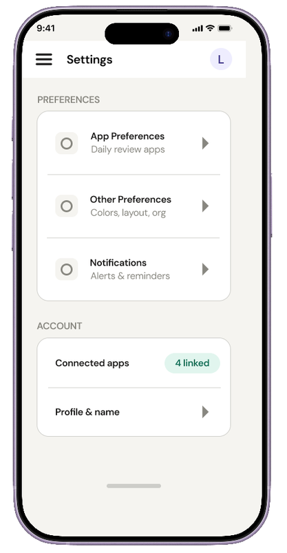
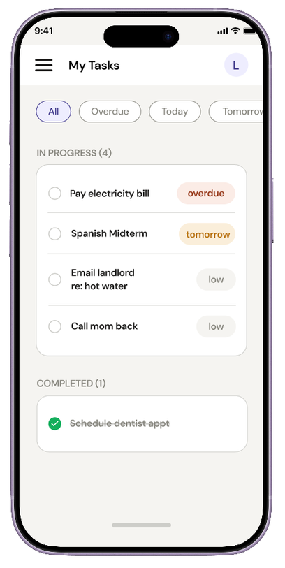
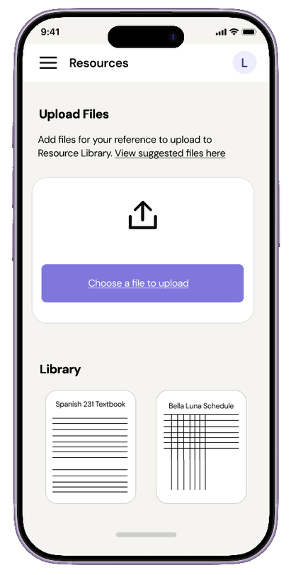
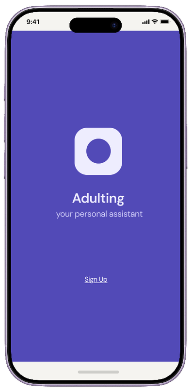
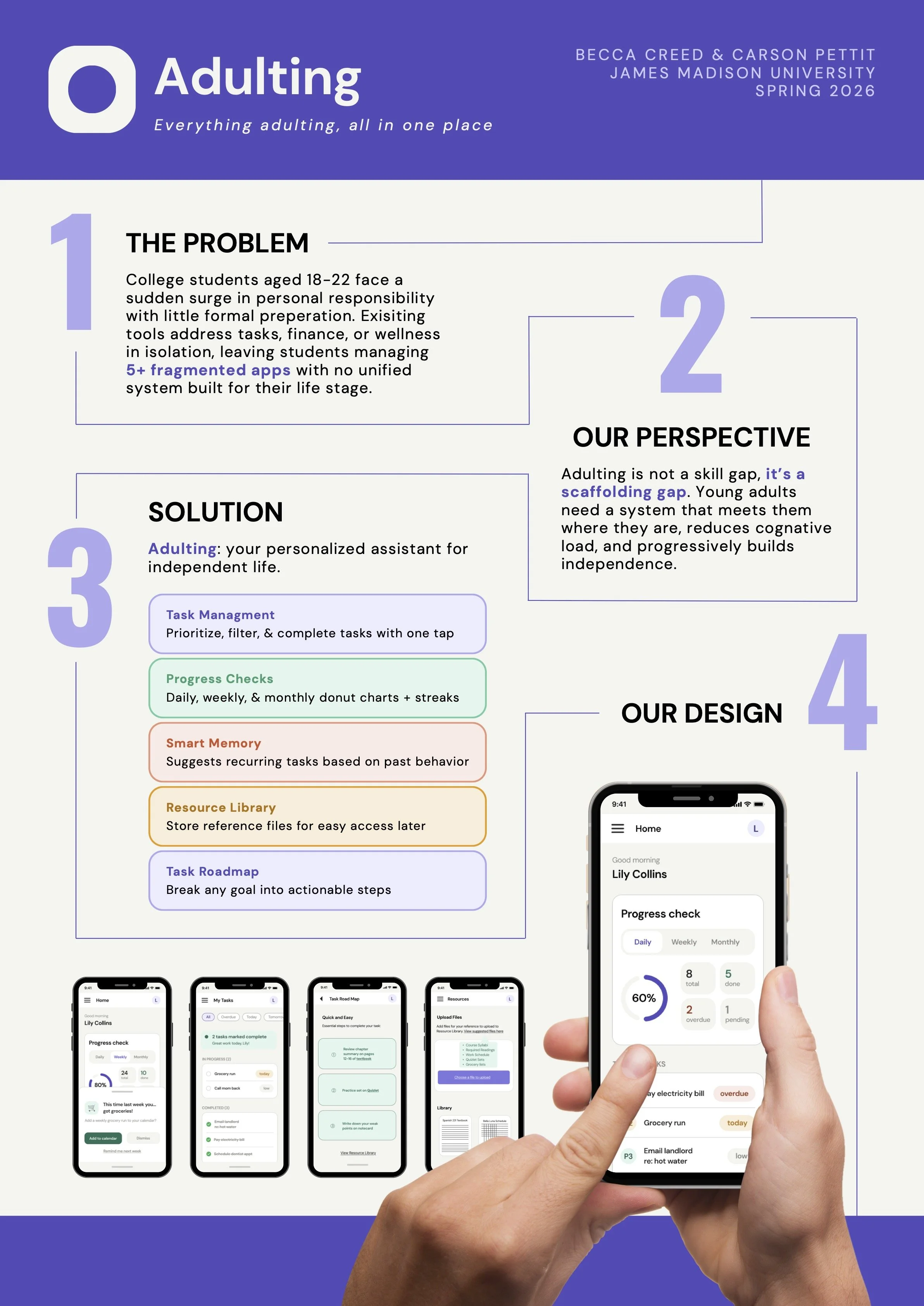
A clickable prototype covering all six flows. I presented it on this final project poster.